Featured Publications
This page highlights a range of specialized print and departmental publications designed to balance core institutional branding with distinct editorial goals. Across major capital campaigns, college magazines, and donor stewardship materials, the design strategy focuses on elevated typography, custom graphical accents, and creative visual themes that guide the reader through dense content. Each piece demonstrates versatility in managing strict brand guidelines, navigating complex client requirements, and turning technical print production opportunities into polished visual assets.
ASPIRE Magazine

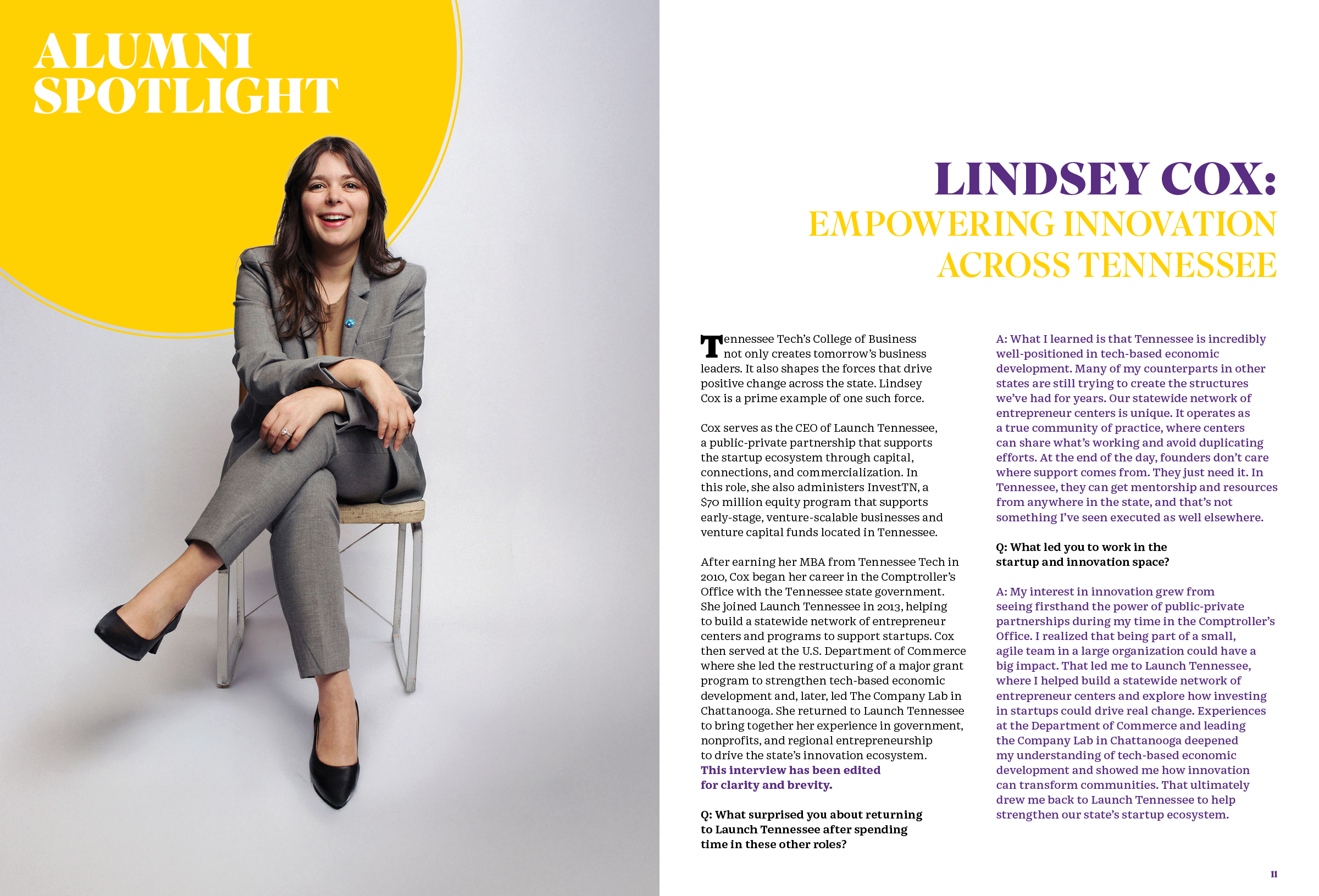
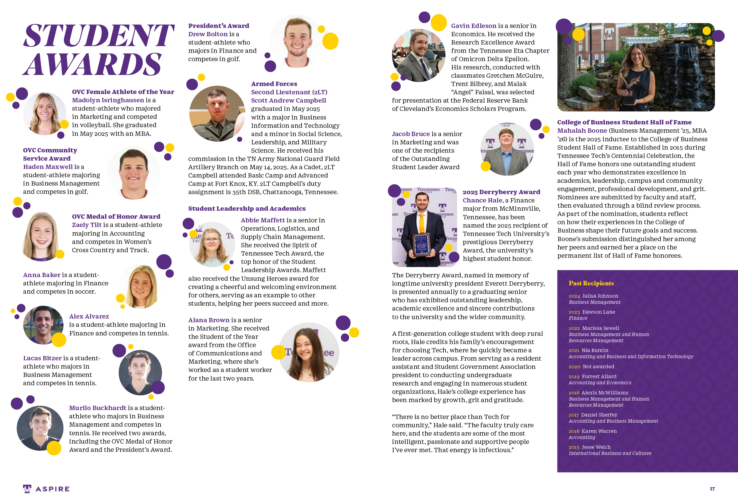
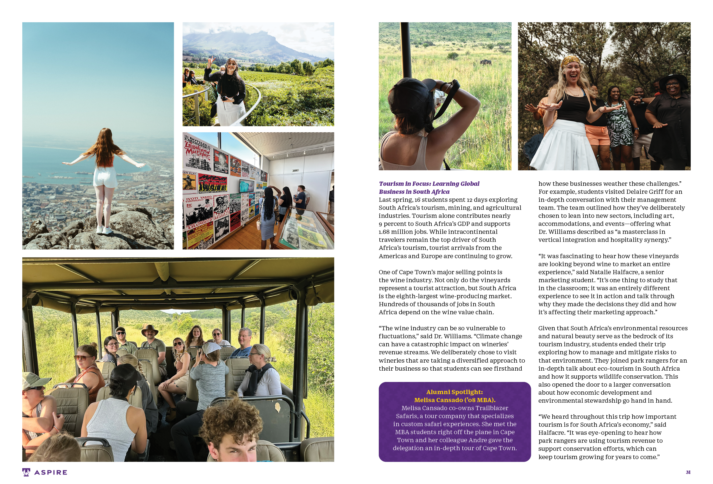
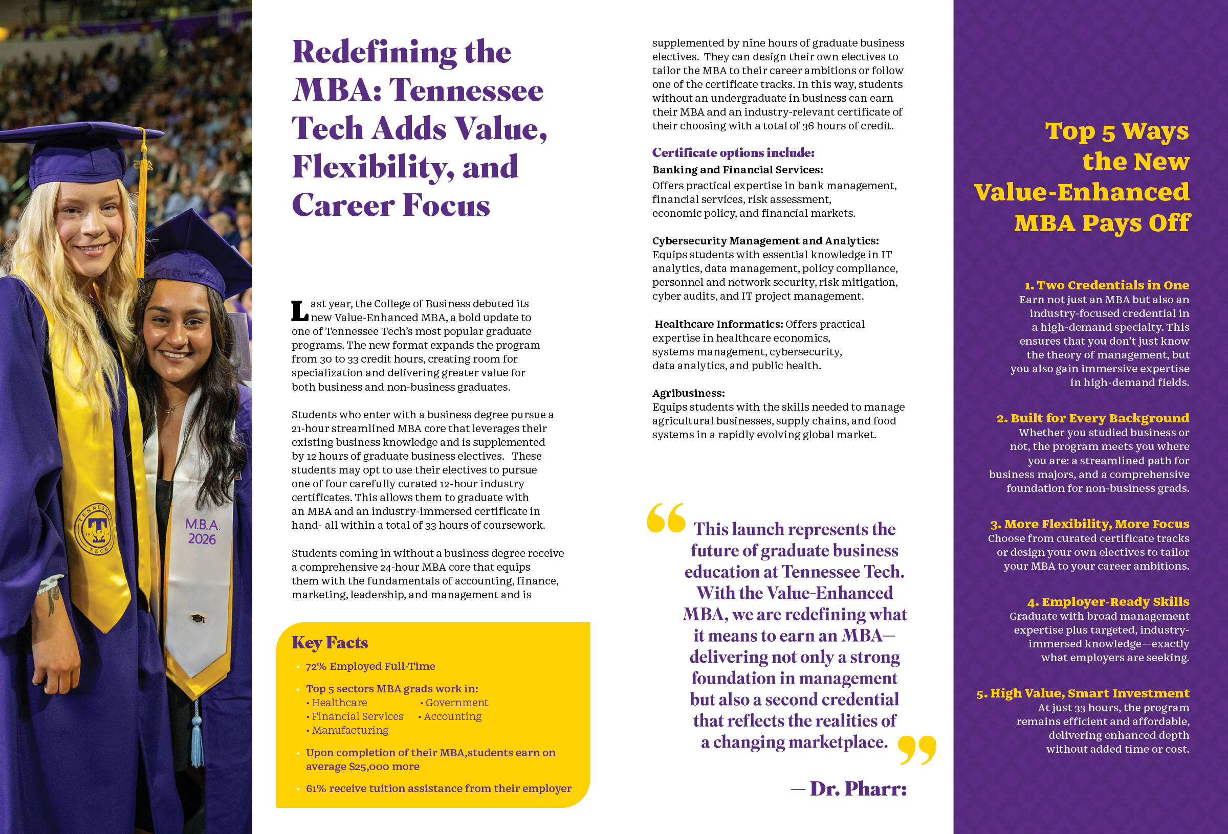
Designed for the College of Business, this magazine publication focuses on modern typographic hierarchy and refined graphic composition. The layout brings structure to diverse story topics and provided photographic assets, navigating strict departmental oversight while being developed to near completion prior to internal handoff.
It’s Personal Campaign Booklet
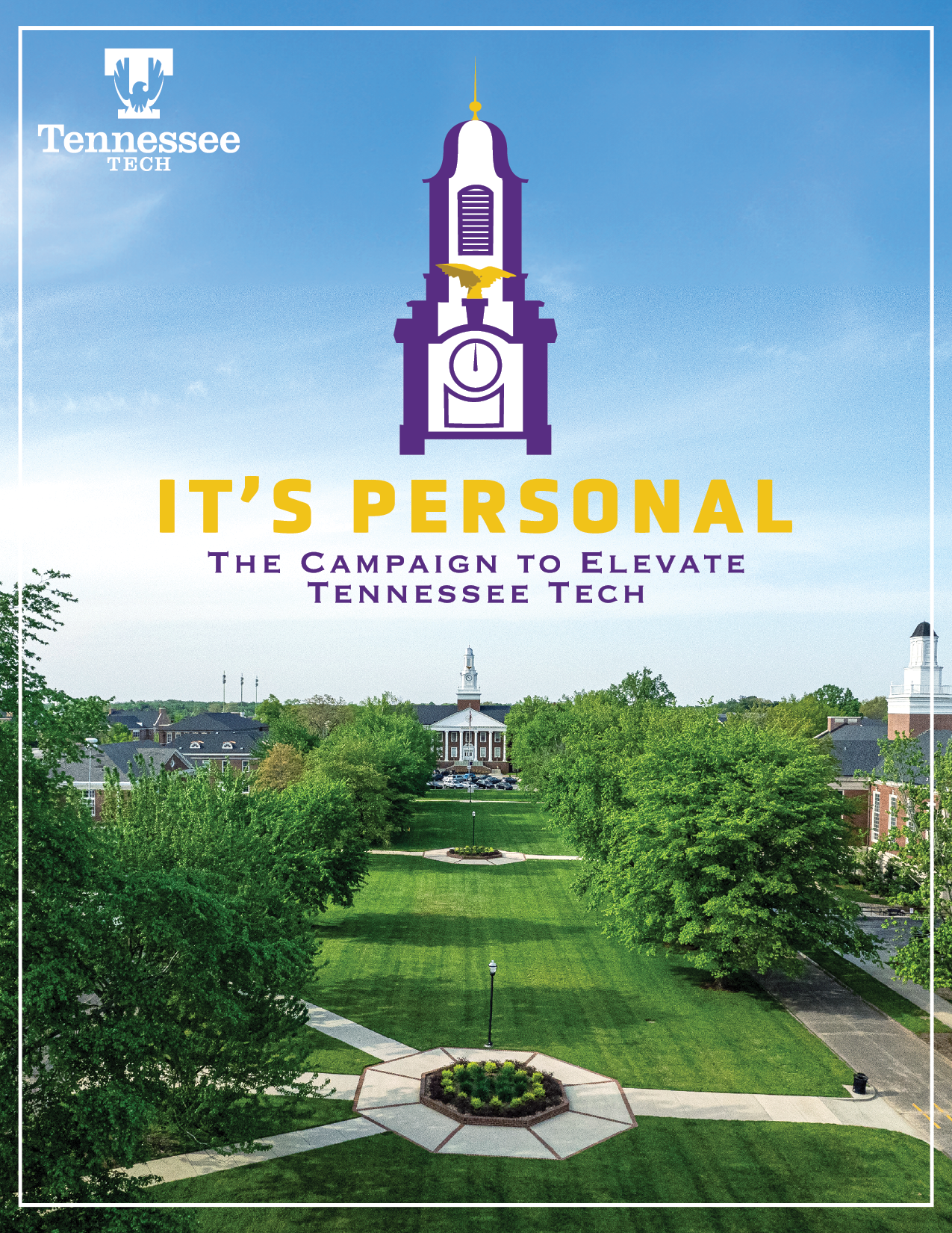
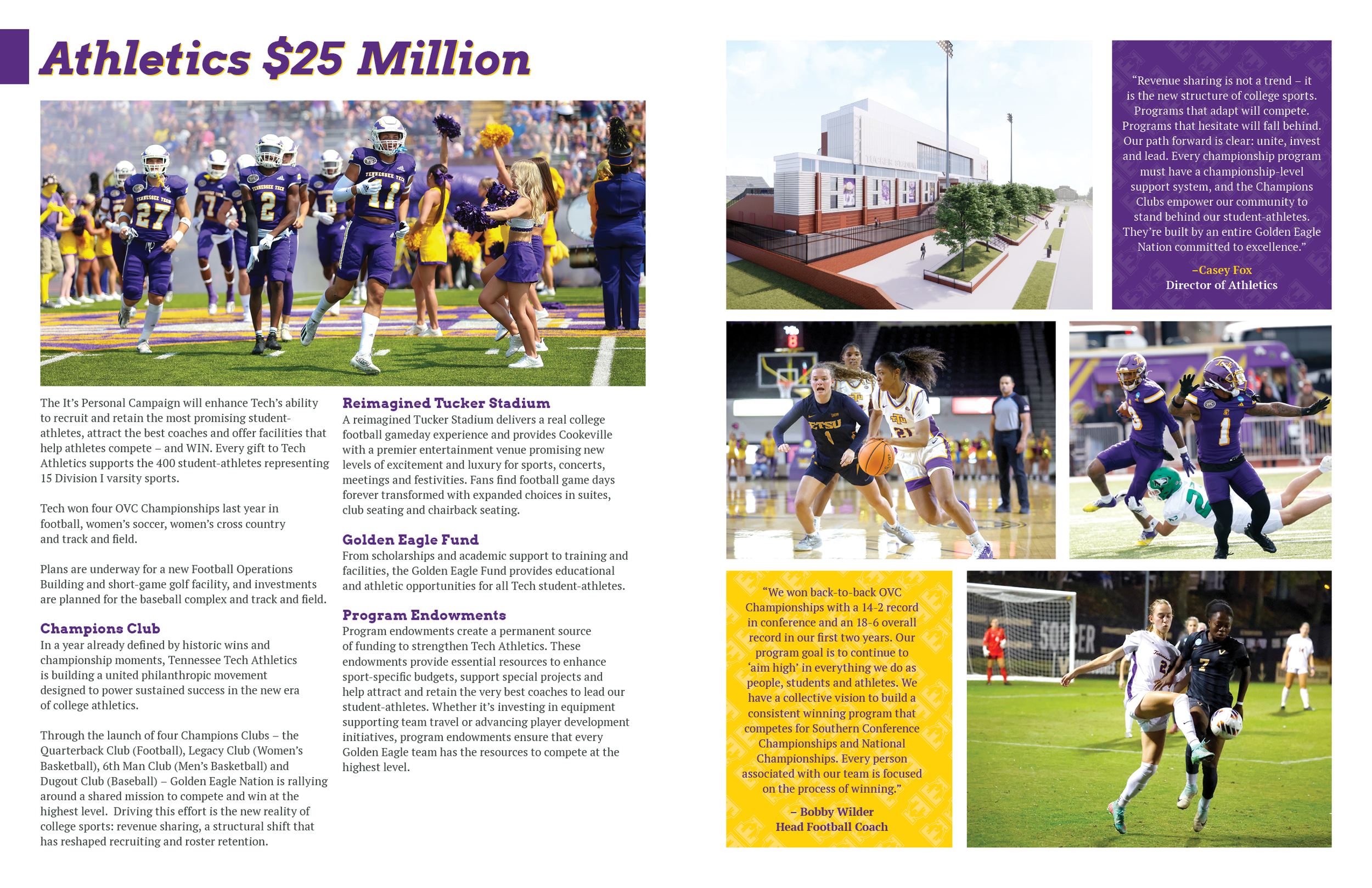
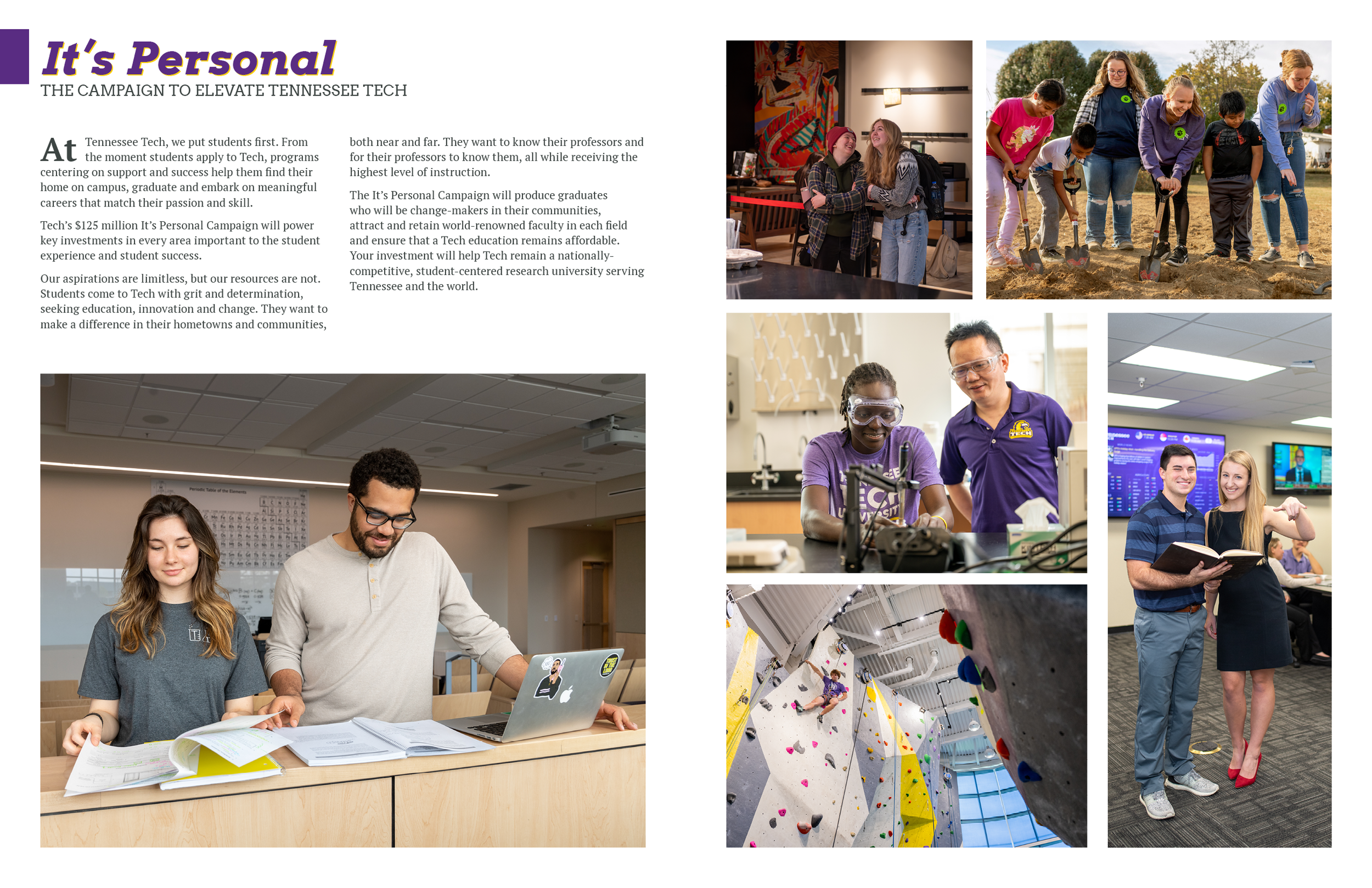
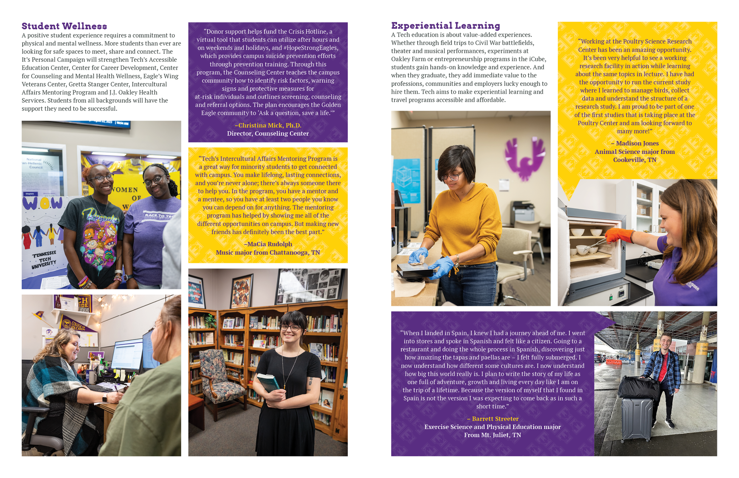
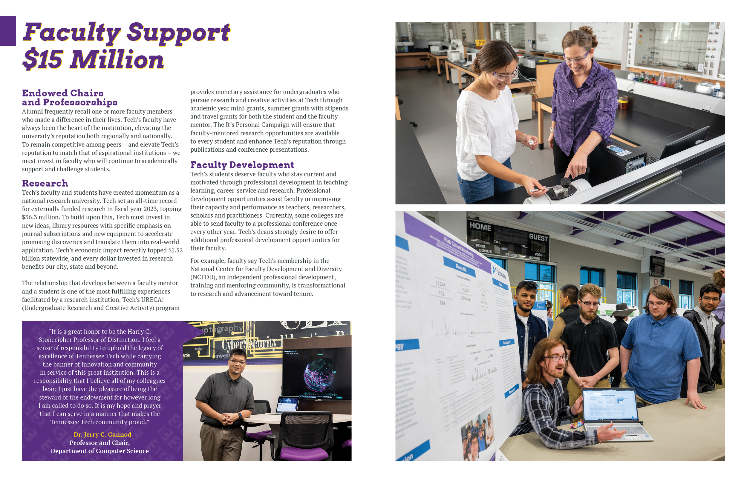
Created to support a $125 million capital campaign, this flagship publication showcases the deep student connection and real world impact that inspired the "It’s Personal" logo and campaign slogan. The piece pairs traditional university branding with serif typography to establish an elevated tone. Custom purple and gold visual elements, including styled quote callouts and balanced typographic hierarchy, organize heavy narrative content cleanly across spreads without overwhelming the reader.
Eagle Drive Magazine
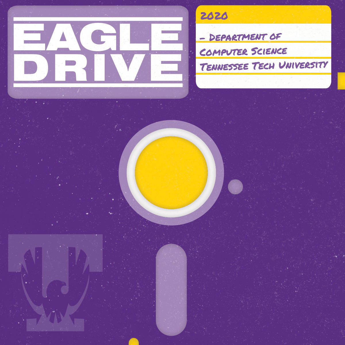
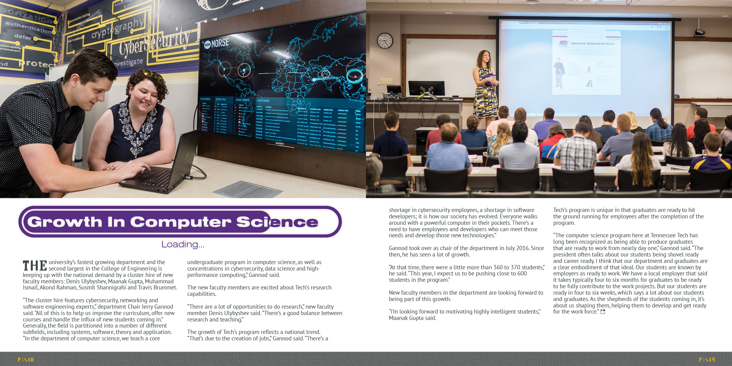
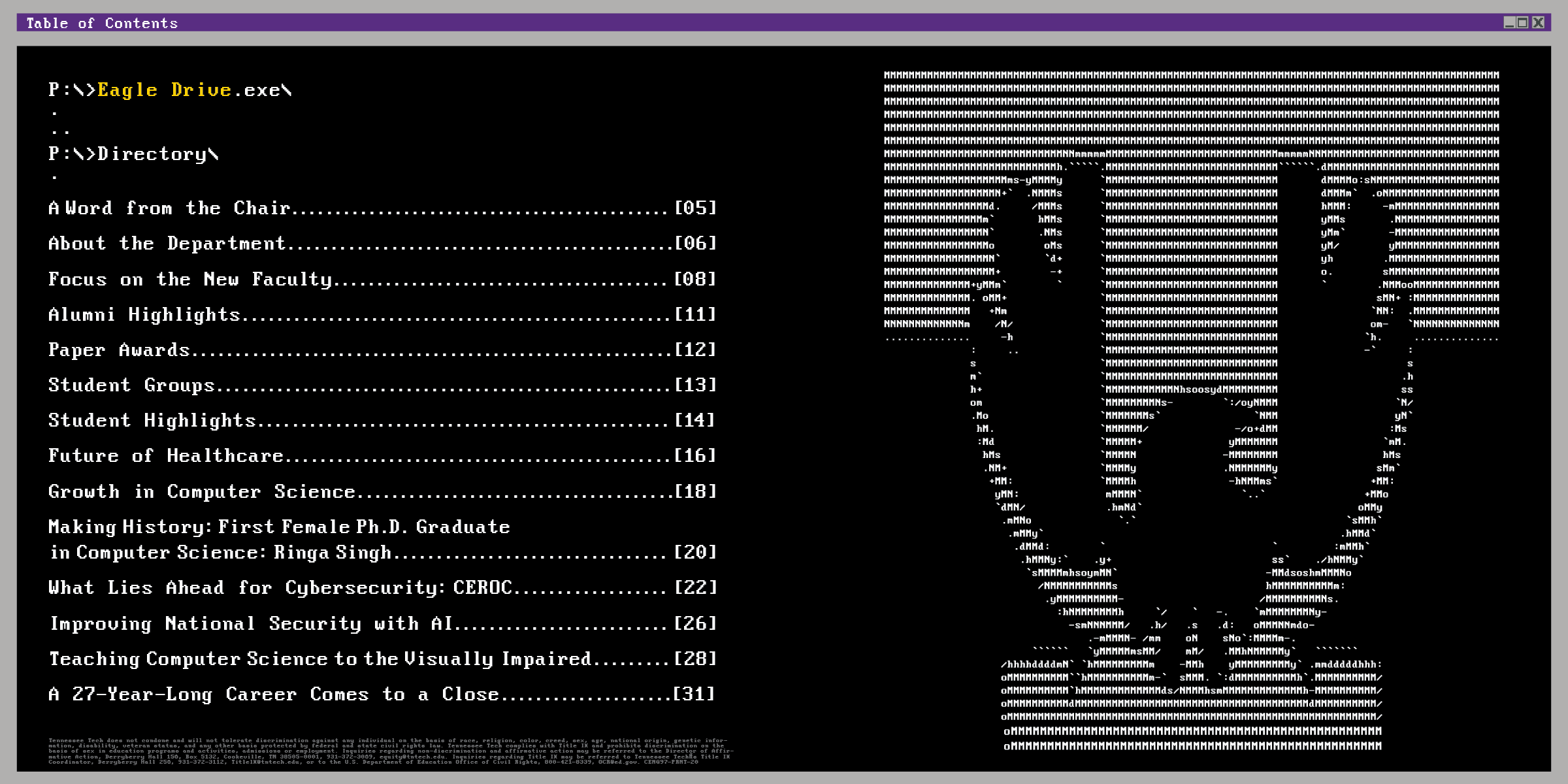
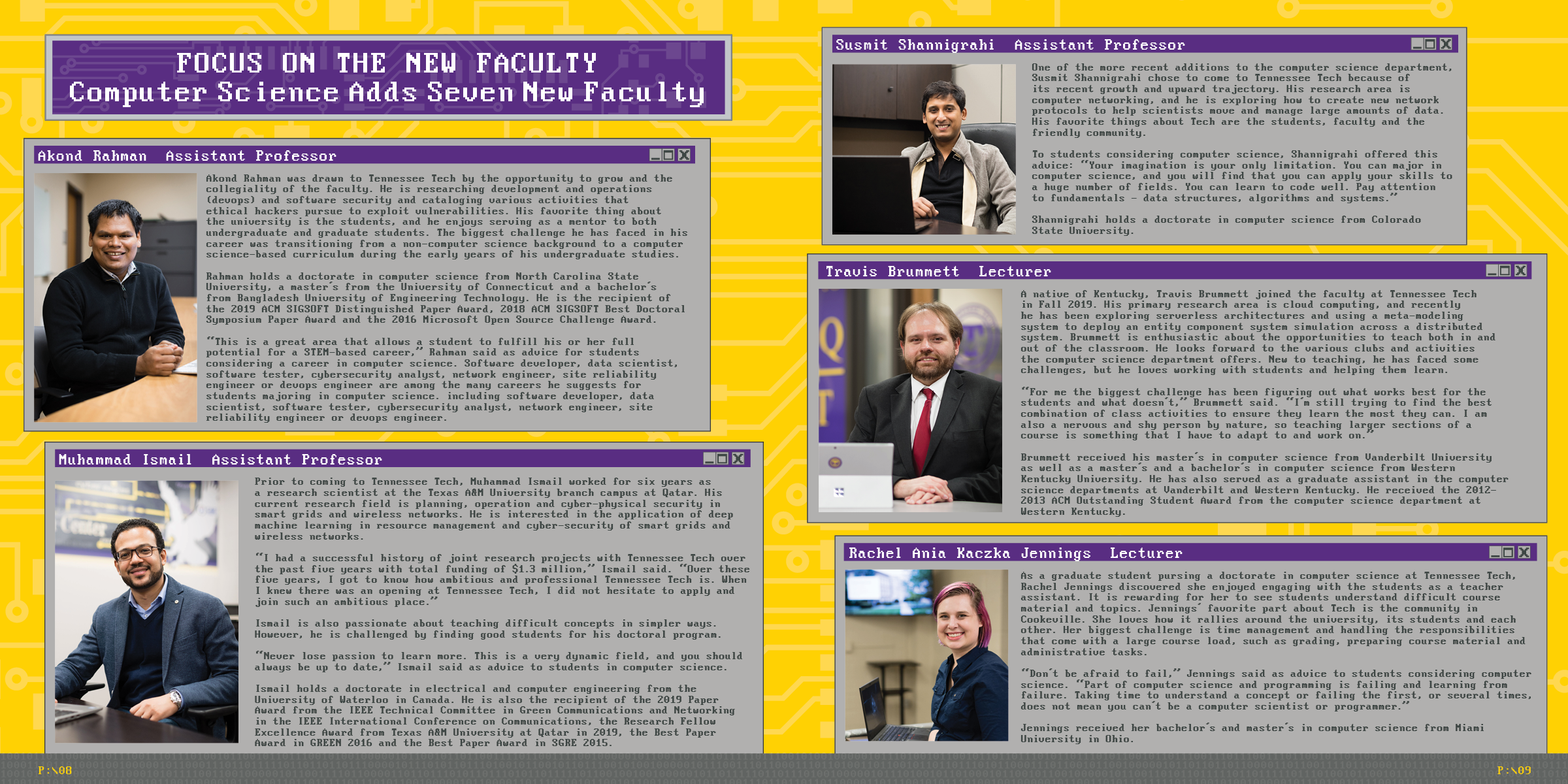

Taking a playful approach to departmental publishing, Eagle Drive Magazine introduces retro computing visual motifs directly into the layout mechanics. The design converts traditional magazine components into nostalgic tech imagery, using file directory styled tables of contents and framed pop-up text boxes to give the publication a distinctive and memorable identity.
Gratitude Magazine
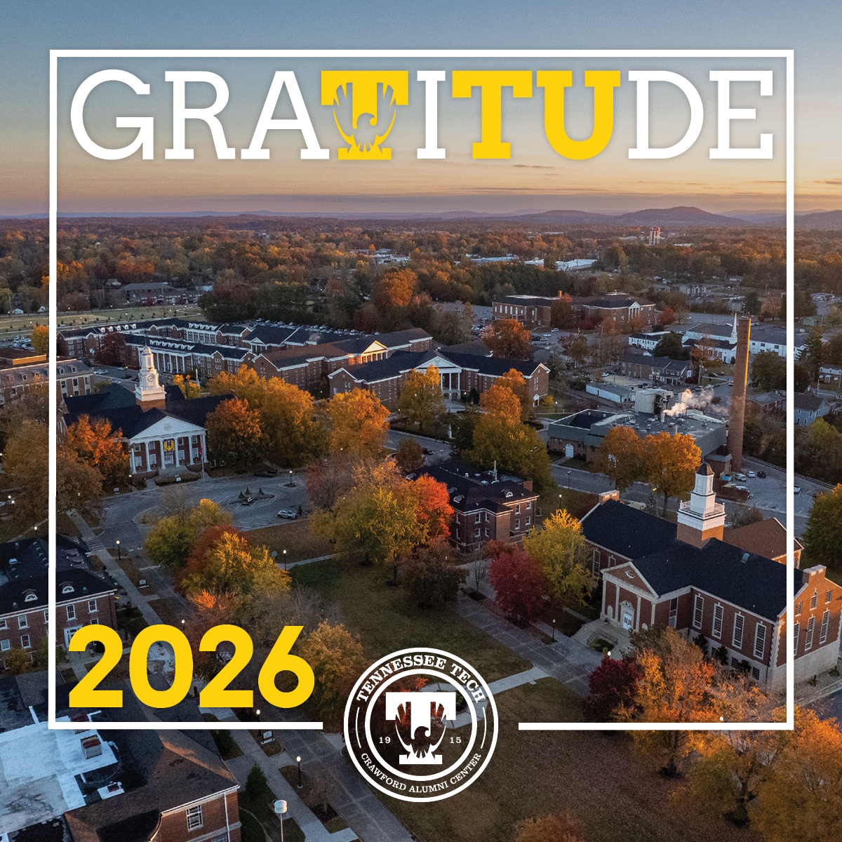
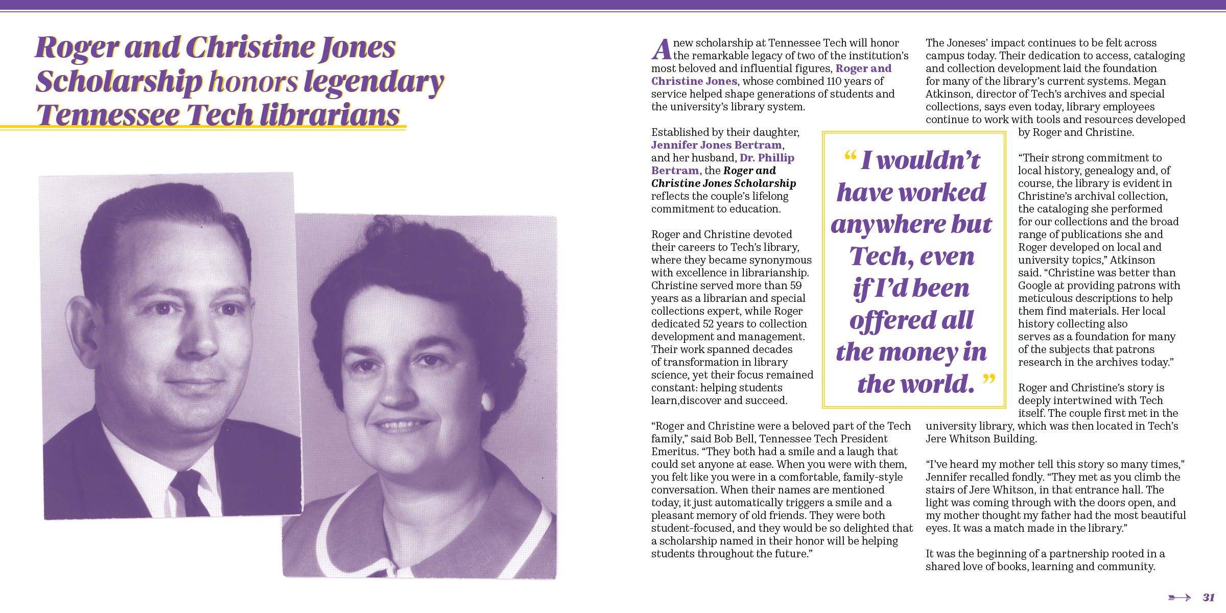
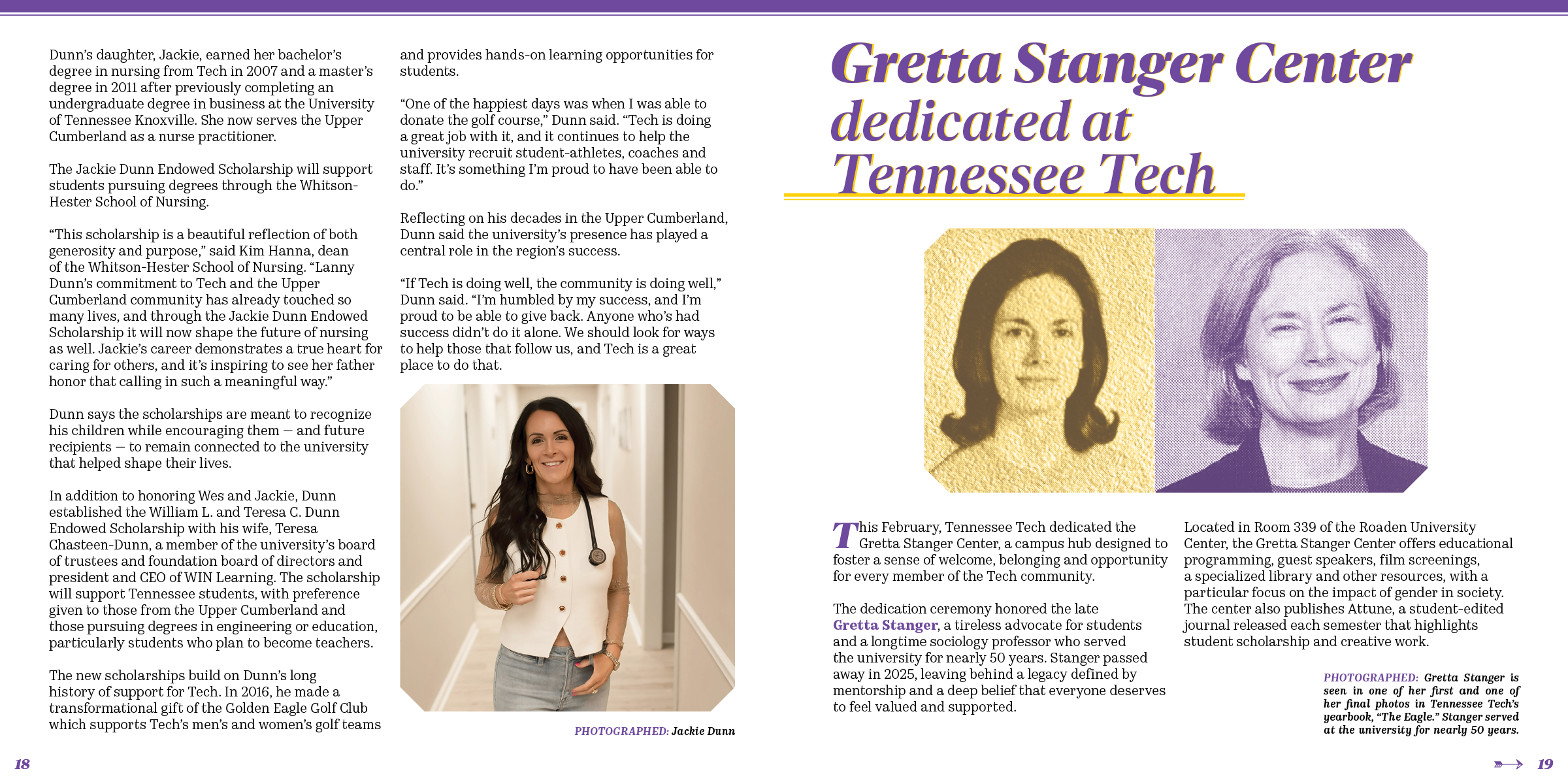
Focused on donor stewardship, Gratitude Magazine transforms a diverse collection of personal donor stories into a high end keepsake piece. To harmonize varied photographic submissions and archival family pictures into a cohesive visual narrative, the design uses custom halftone textures, detailed photo retouching, and elegant bezeled image framing. The project also thoughtfully refined submitted artwork to align smoothly with brand policies, celebrating philanthropic impact with warmth and polish.